Product Management, MVP
Figma Toolbox
In Spring 2023, I joined the third cohort of Ivey Product Society (IPS), a community of Ivey alumni PMs dedicated to mentoring students interested in exploring early careers in product. Over four months, we took part in an intensive bootcamp with workshops, seminars, and networking opportunities to learn, connect, and grow with each other.
For our capstone, each of us chose a product we admired and stepped into the role of its PM. We wrote a PRD, constructed an MVP prototype, and presented our approach to a panel of industry leaders in classic demo day fashion.
Project Link: Here
Mentors: Matthew Woo, Mary Yao, Jeet Chakrabarty, Justin Zhang
Duration: January 2023 – April 2023 (4 months)
Skills: User Interviews, User Testing, Prioritization, Prototyping, Product Docs
I. Overview
Context
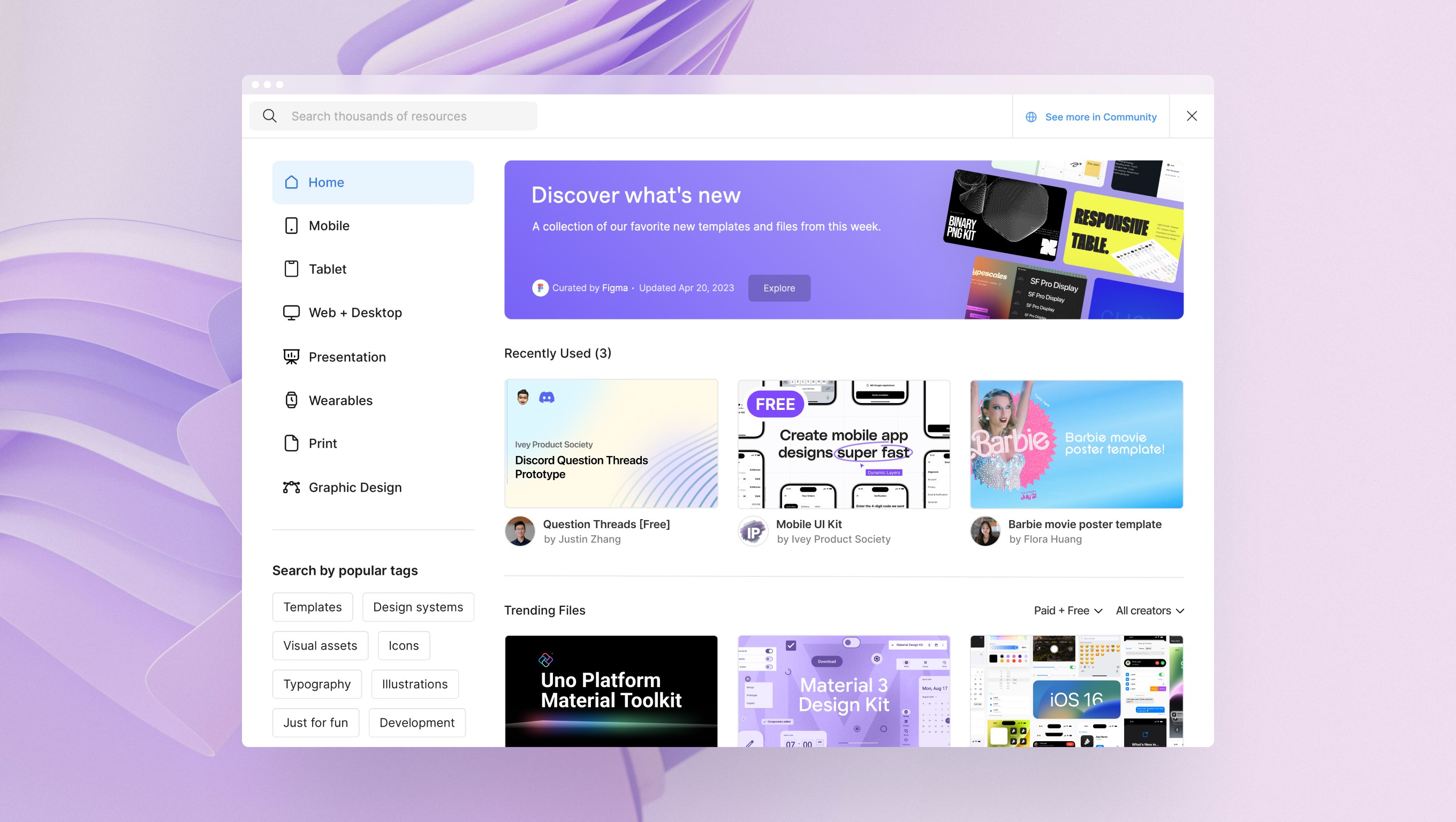
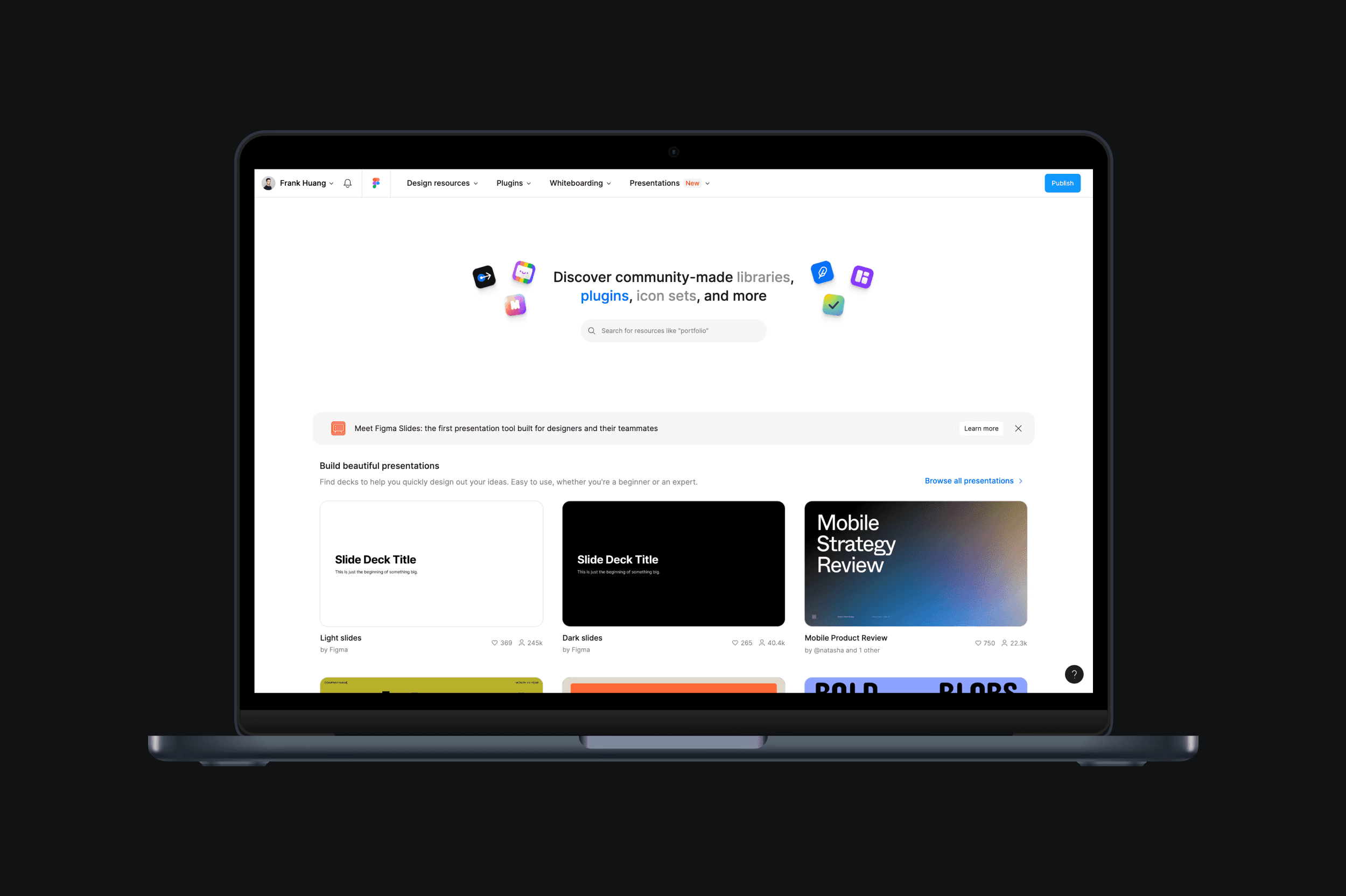
As a self-proclaimed Figma power user since 2019, I have found Community to be one of its most useful features. Figma Community is a platform that allows users to publish their files, widgets, and plugins, creating a collaborative space for designers and developers to learn, interact, and support each other. What started as a product to discover creative work has since evolved into a thriving ecosystem of individuals, teams, and organizations contributing thousands of resources for millions of users.
The Challenge
In 2023, Figma Community was still an emerging product vertical that followed a GTM playbook inspired by the likes of GitHub and Dribbble: part collaborative infrastructure for remixing files, part social layer for showcasing creative work. But despite a compelling vision, Community struggled to find PMF. In speaking with my cohort, I also heard recurring frustrations about the general experience, from difficulty finding the right inspiration to managing disorganized files after duplicating a resource.
With these conversations in mind, I set out to explore:
Whether there was a viable opportunity to improve the product
What the core problem was, and how a solution might take shape
How to bring that solution to market
II. My Role
My Approach
Since the Fellowship was led by PMs from some of the world’s top product companies, its curriculum was heavily influenced by the leading practices used by their teams. There were a few key considerations that guided my approach as I moved through the end-to-end process of building my MVP:
Recognizing Opportunities and Limitations: Naturally, this project did not have any real-world budgets or timelines, which gave me the room to explore ideas more freely. With that being said, there were still clear limitations: I didn't have access to actual user data, feedback, or analytics to guide decisions or run experiments. Instead, I had to focus on what was achievable and build within those constraints, rather than imagining how things might have played out if I were a real Figma PM.
Prioritizing Skill Development: When writing my final PRD, I used it as an opportunity to put the concepts and frameworks I learned into practice. This meant that, instead of trying to replicate what Figma's internal docs might look like, I approached the process as a way to showcase my growth, which ties back to the idea of being pragmatic. That's also why some sections may go deeper or include more context than what a typical PM would likely include.
My Process
A. Opportunity Identification
For the first stage of my capstone, I began by clarifying the problem space and narrowing in my customer persona: early-career designers with less than four years of experience using vector-based tools like Adobe XD, InVision, and Sketch. Using the Jobs-to-be-Done framework, I focused on their core job—conceptualizing creative projects—and audited the current Figma Community experience to uncover potential friction points along that journey.
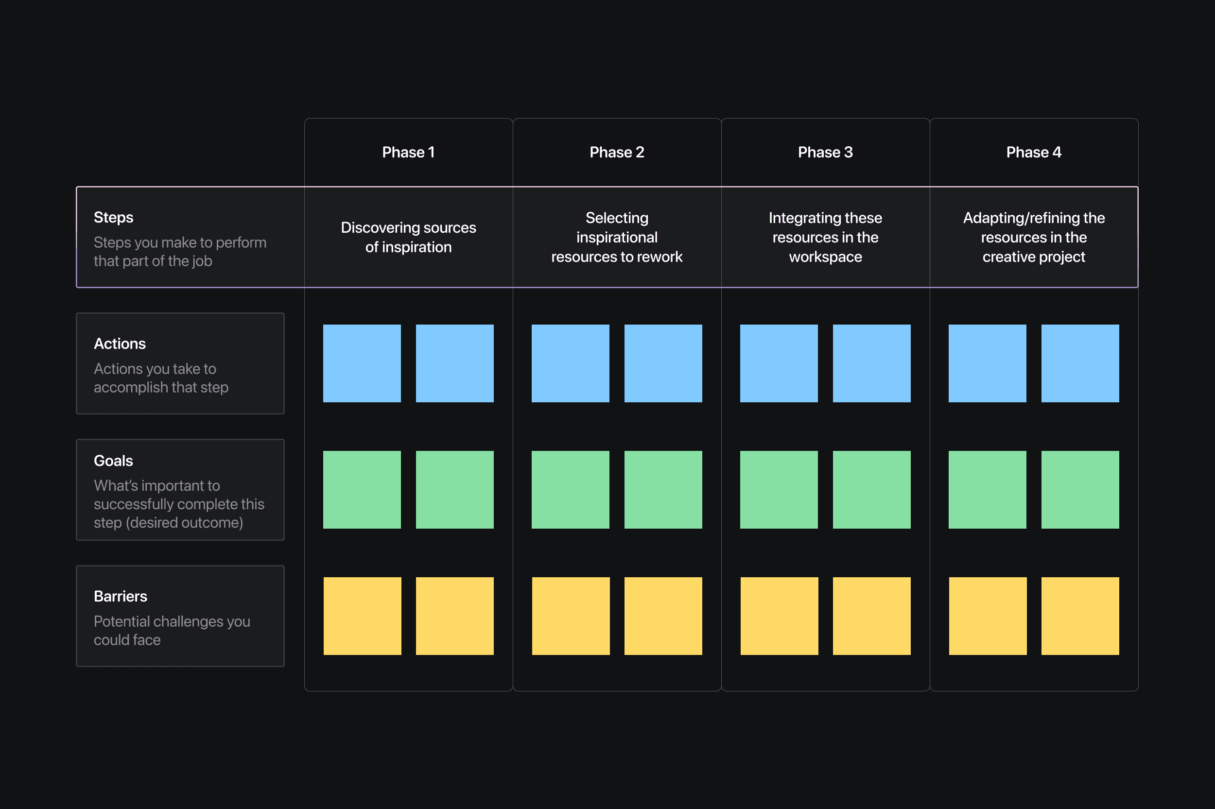
Next, I ran eight UXR interviews with members of my persona group to validate these barriers and add more colour to:
Why they use Figma Community
What jobs they expect it to accomplish
What forces are keeping them “locked in” to the current experience, despite its pain points
These interviews helped me fine tune my job map, validating some assumptions while surfacing new actions, goals, and barriers I hadn’t previously considered. They also revealed what kept many users from changing their habits, whether it was a preference for staying within a single platform or a reluctance to add extra steps to their workflow. Understanding what ultimately brought them back pointed me toward where the Community experience could meaningfully improve, and how to make those improvements feel worthwhile.
Drawing from my UXR interviews, job map, and four forces analysis, I framed my thinking for the next phase around the following question:
"How might we enhance the search and discover experiences of Figma's Community product?"
B. Defining Product Scope
Once I had a clearer view of my target persona and their jobs to be done, I turned my attention to identifying which of their needs my product could realistically support.
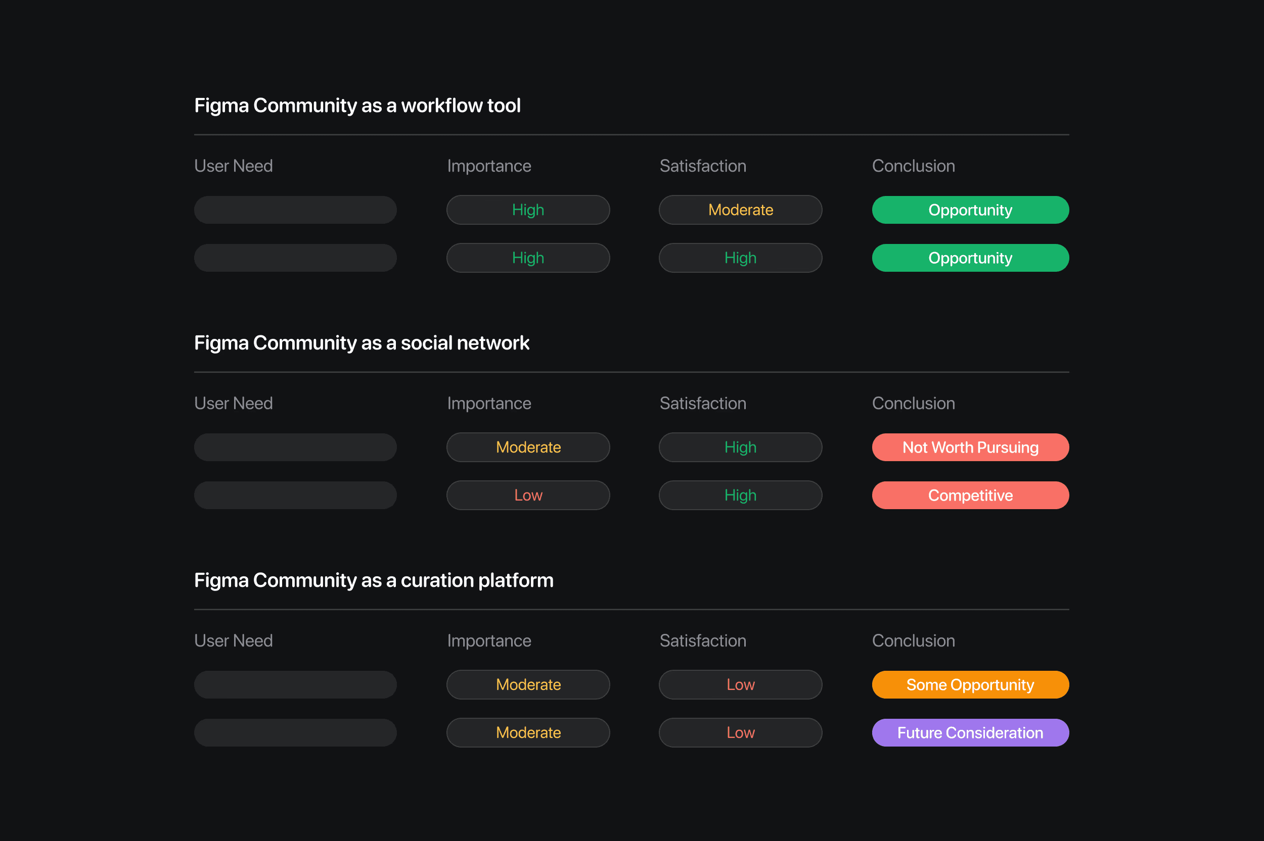
I started by pulling a list of needs from my updated job map into a matrix that assessed (a) how important the need was, and (b) how well current solutions were addressing it. This exercise helped me distinguish potential opportunities from crowded or low-impact ideas. Through this process, I zeroed in on a set of high-priority, underserved needs, positioning Figma Community as a tool better suited to support the design workflow over use cases like content curation or social networking.
To further clarify the problem space, I used the Kano Model to distinguish between must-haves, performance benefits, and delighters in design workflow tools. I reviewed comparable experiences like Canva Templates and Sketch Libraries against my list of user needs to better understand where my MVP could stand out or fall short. This analysis helped shape the following value proposition:
“An efficient, integrated, and familiar solution for sourcing high-quality creative assets that inspire the design process”
which aligns with my product hypothesis:
“By streamlining how designers find and use resources, Figma can reinforce the idea that design is intuitive, approachable, and fun. In turn, designers will be more inclined to incorporate Community assets into their workflows, fuelling both supply- and demand-side engagement.”
C. Crafting an MVP
With a clear value proposition in place, my next step was deciding the right feature set for my MVP. Building on the idea of Figma as a workflow tool, I broke the product down into smaller feature ideas that mapped across key phases of the product experience: onboarding, task-in-progress, and task completion.
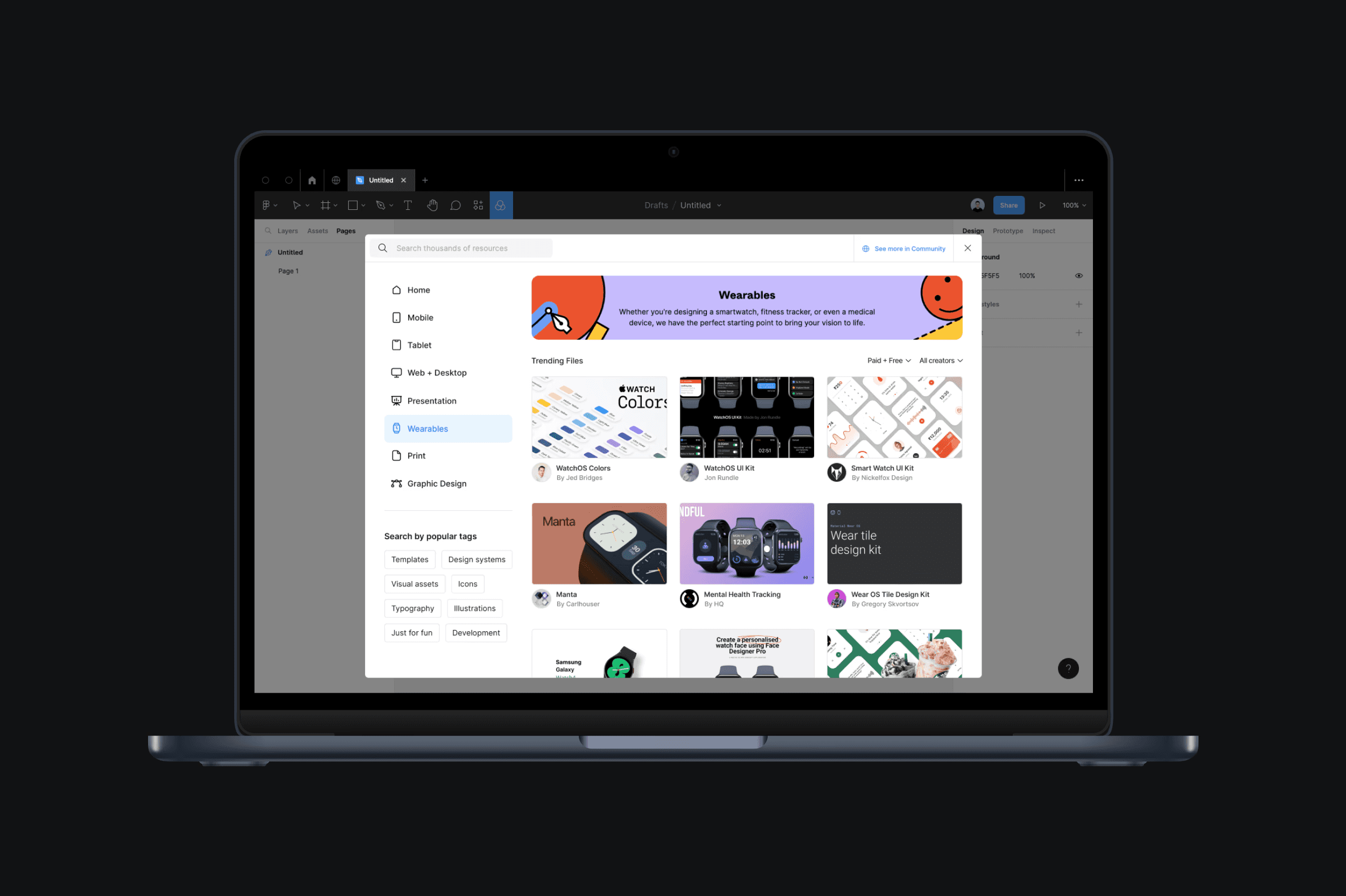
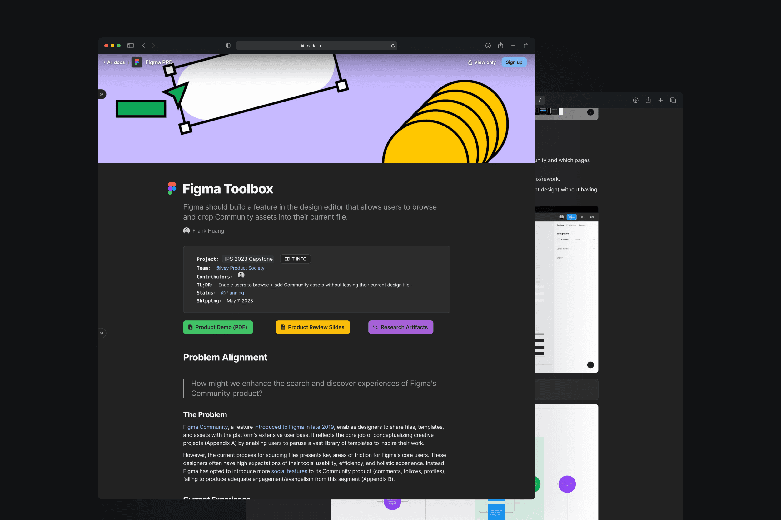
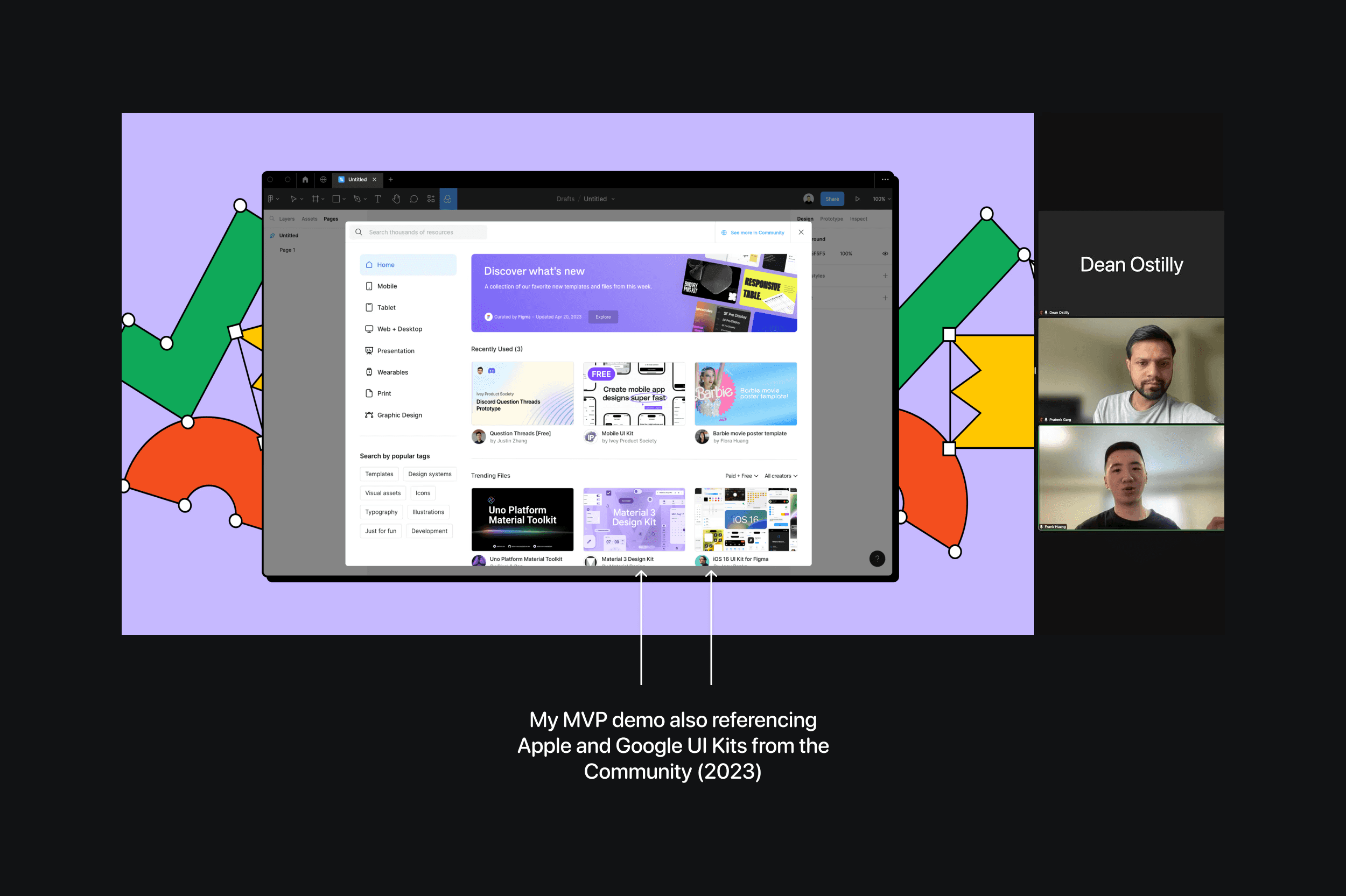
I prioritized only the essential features to validate my hypothesis and visually mapped the MVP feature set through a user flow, which became the foundation for my prototype. After several rounds of wireframing and design, I landed on a final MVP for “Figma Toolbox,” a feature within the Design Editor that allows users to browse and directly insert Community resources into their canvas.
D. Analytics, Testing, and PRD Development
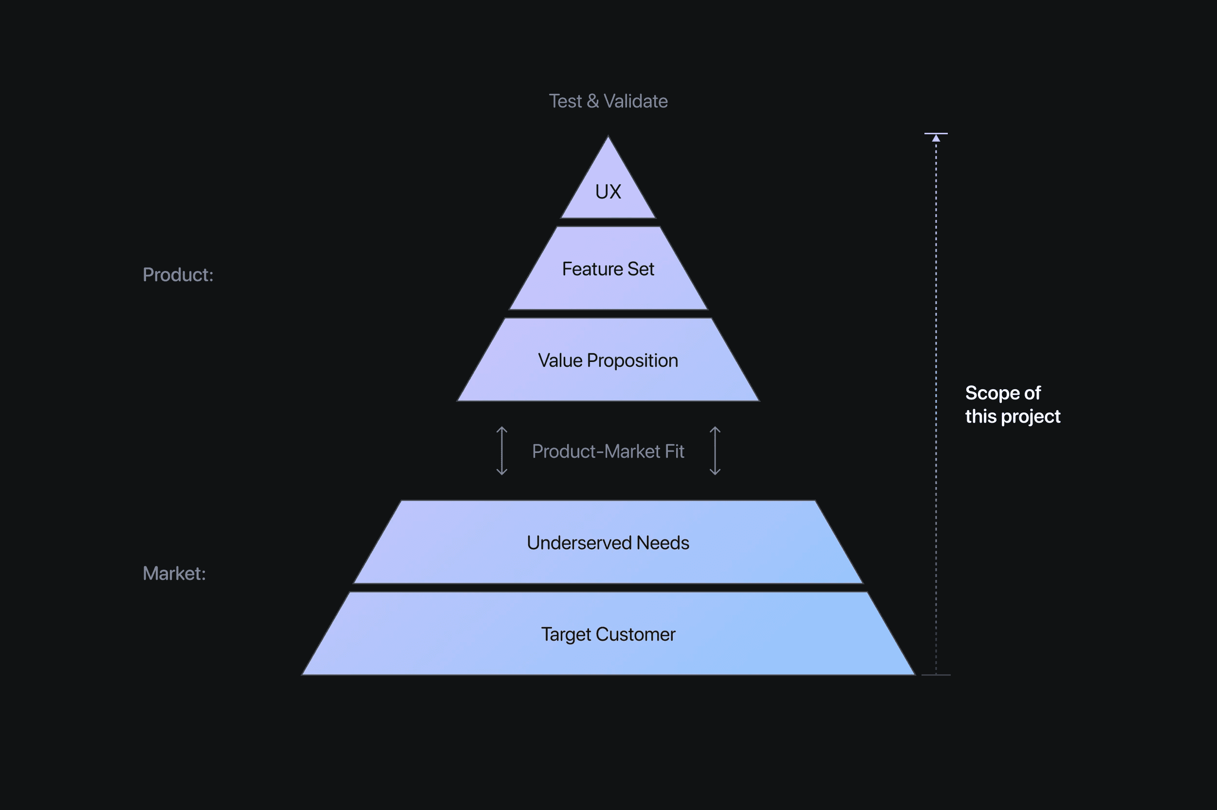
At this point, we were past the halfway mark in our capstone. I had clarified the problem space, defined a solution, and now had my sights set on the jumping-off point of the product development pyramid: testing with customers. I began by defining a set of success criteria, along with counter-metrics to ensure I wasn’t solving one problem at the expense of another. I also created a phased rollout plan with clear exit criteria at each stage to assess launch readiness.
Once the prototype was ready, I ran five user testing sessions with cohort members to better understand how people were interacting with the MVP. These sessions revealed what felt intuitive, what didn’t land as expected, and where user expectations differed from my design intent.
For the final step in my capstone, I pulled everything together into a PRD on Coda—fittingly, the same platform that Figma’s internal product team uses for their documentation.
My Impact
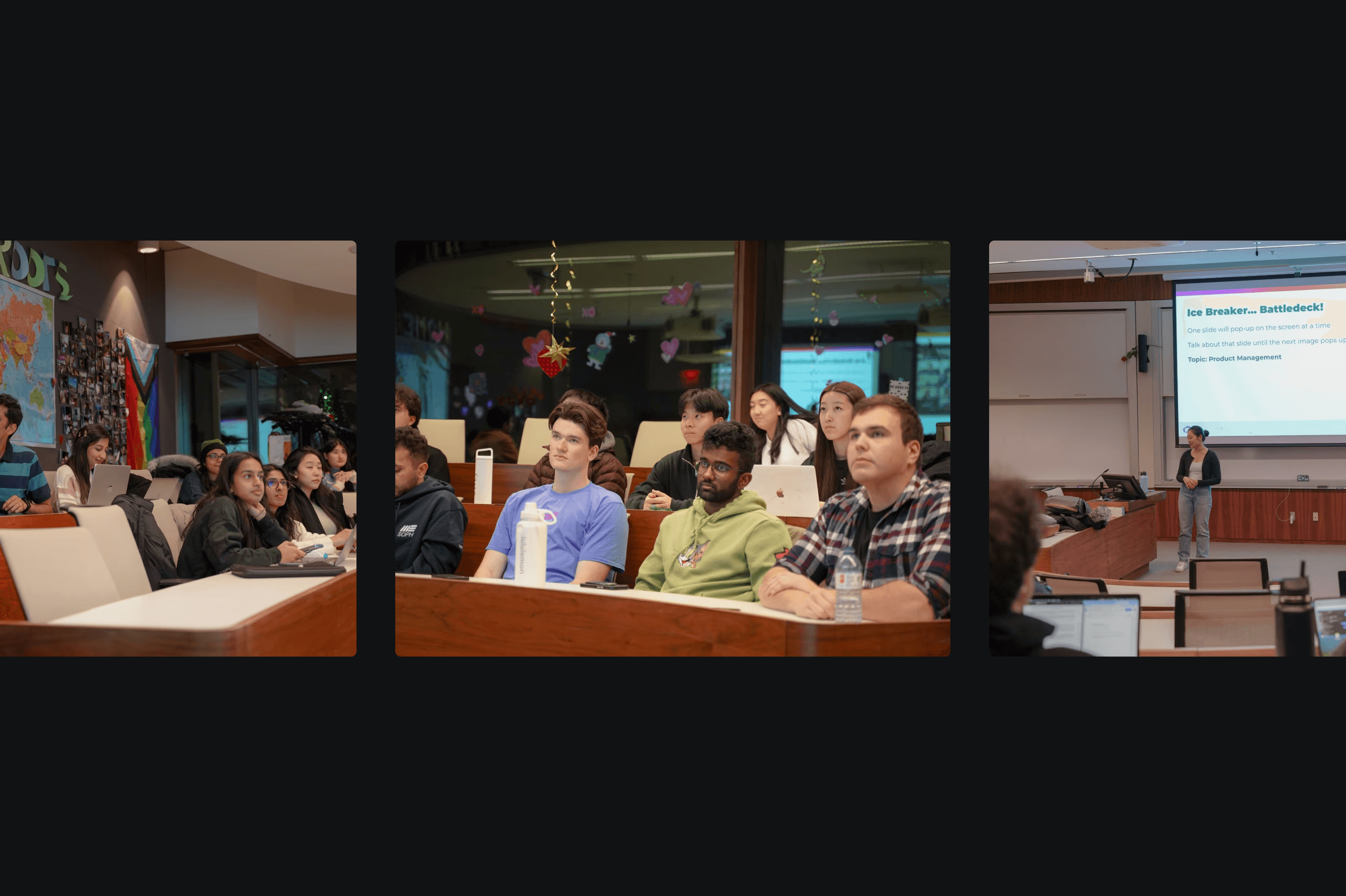
On Demo Day, I came prepared with a working prototype, a presentation, and a full PRD for my MVP. I pitched my concept to Product Leaders at Google, Meta, and Uber, walking away with thought-provoking feedback and perspectives, especially around driving demand- and supply-side growth within an embedded marketplace (e.g., Notion Templates, Airtable Extensions, Arc Boost Gallery, etc.).
This fellowship gave me a deeper understanding of how the world’s top tech companies approach building 0-to-1 products. More importantly, it connected me to a network of current and aspiring PMs, a community I continue to support today through 1-on-1 mentorship and coffee chats.
III. Reflections & Takeaways
Key Learnings
Iterate Fast: One of my early MVP ideas was to explore monetization mechanics within Figma’s existing Community model, giving designers a way to sell their resources, similar to platforms like Gumroad or UI8. But just a week after I started working on the concept, Figma released the exact same feature, forcing me to pivot. While my intuition was on point, the experience was a good reminder that execution eats strategy for breakfast. Props to Figma for getting there before me.
Play Devil’s Advocate: One piece of feedback that came up consistently across all our Demo Day presentations was: “This is a great concept, but why do you think it hasn’t already been shipped?” It was a great reminder that even the strongest ideas don’t always make it to market. There are often factors beyond the idea itself, like feasibility, budget, timing, or execution. Learning to challenge your own assumptions and ask ‘why not’ is just as important as making the case for ‘why now.’
Jam With Others: One of the best parts of building alongside other builders, instead of alone, was being able to bounce ideas freely off my cohort. Anyone I wanted to chat with was just a Slack message away. At one point, I mentioned how I was struggling with participant engagement during my early user interviews. A fellow (now a Google APM) suggested I ask participants to share their screens and walk me through how they literally searched for files in Community. That small tweak unlocked much richer insights in the sessions that followed, as participants were able to recall pain points and observations that they wouldn't have been able to articulate otherwise.
Conclusion
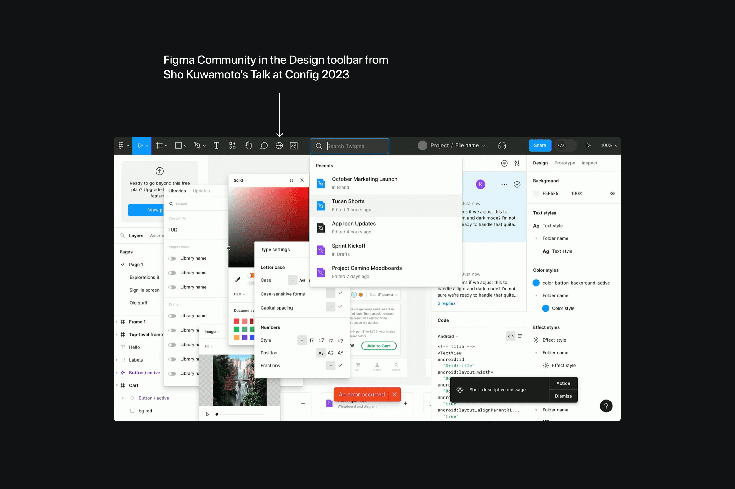
While Figma never ended up releasing my feature IRL, the Community icon made a brief cameo on the toolbar during a Config talk by Figma’s VP of Product, suggesting that there were, at some point, internal discussions about bringing it into the editor.
So why didn’t it happen? It’s hard to say for sure. What we do know is that a big part of Figma’s 2023 roadmap focused on improving the developer experience, and many of their subsequent releases leaned heavily into generative AI. From Figma’s perspective, there likely wasn’t enough internal or customer pain to justify prioritizing it.
That said, in June 2024, Figma shipped a feature called UI Kits, which allowed designers to directly pull assets published by Apple and Google onto their canvas.
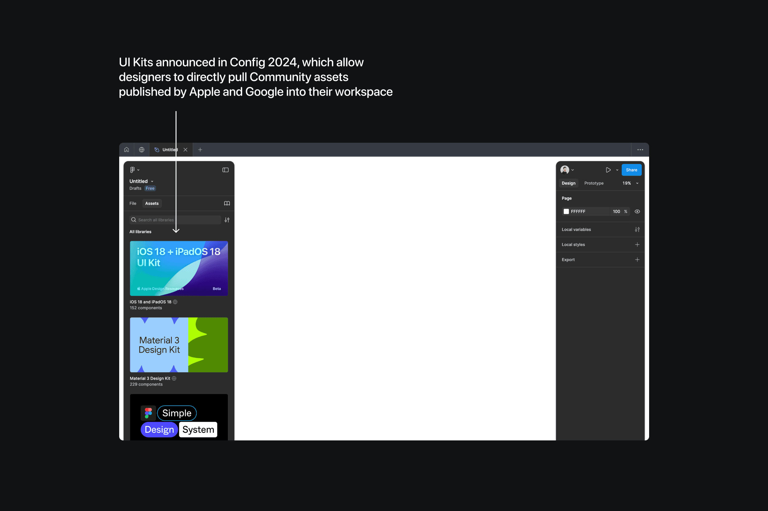
While these libraries come from two of the most respected design teams on the planet, they are still Community resources at the end of the day. So, even though my MVP didn’t make it onto Figma's roadmap, my core hypothesis—that integrating pre-built assets into the design workflow adds customer and business value—still found its way into the product.
By the end of the fellowship, I had developed the skillset, confidence, and readiness to interview for early product roles. I credit IPS for helping me land a position at ClearBlue Markets, where I was able to apply everything I’d learned over these four months in a real-world context while uncovering some surprising differences between how product is taught and how it’s practiced. Curious to see what that looked like? Check out my case study here.
Discover more
